

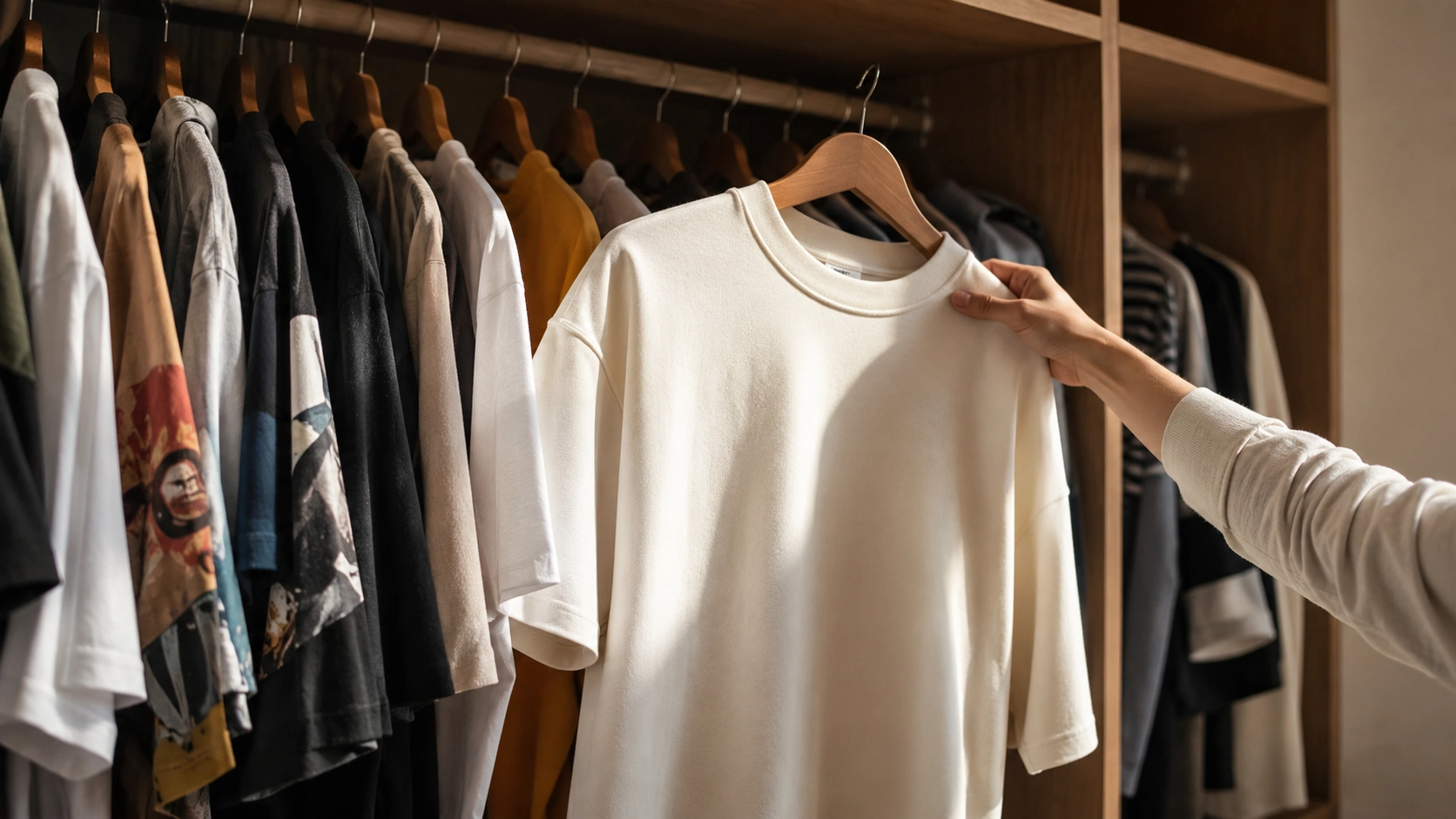
Nobody has ever complimented a logo. They compliment the way a shoulder sits, the way a color stops fighting the room, the way a T-shirt still holds its shape on wash forty instead of collapsing by wash four.
That’s the part most quiet luxury content skips. Search the term and you’ll land on the same list, restyled a dozen ways: buy this logo-free label instead of that one, wear beige, invest in a “quality” watch. It’s a shopping list wearing a philosophy’s clothes. The actual idea behind quiet luxury was never about which brand you swap in. It was about learning to see. Once you can read a garment the way an editor does, you stop needing anyone’s permission, or a price tag, to look like you have money you don’t necessarily have.
Quiet luxury without money comes down to three things you can check on any garment: fabric weight, fit precision, and color discipline. None of them require a designer label.
This is that skill: how to look considered without spending like it, broken into parts you can actually use.
What the Trend Got Right, and What Got Lost Translating It
The original insight was simple: stop paying for things whose only job is to be noticed. Somewhere between the runway and the algorithm, that got flattened into a checklist: neutral palette, tailored blazer, logo-free tote, a watch with a plain face. None of that is wrong. But a checklist is a shortcut for people who’d rather copy the answer than learn how it was reached. And a shortcut followed by a few million people at once stops being restraint. It becomes a uniform, which is the exact opposite of what the aesthetic was supposed to signal.
A paradox sits inside that advice that nobody quite addresses directly. The whole point of this aesthetic was supposed to be that you weren’t performing for anyone. Yet the guides ask you to follow an identical five-item checklist as a few million other people scrolling the same trend cycle at the same time. That’s not restraint. That’s a different performance, with a lower price tag attached, but a performance all the same.
Most of that advice has a quieter problem too: it assumes a wardrobe of blazers, trousers, and dress shoes. Most people’s closets aren’t that. They’re T-shirts, hoodies, joggers, the things actually worn most days of the week. And almost nothing written about this trend tells you how the same principles apply there. They do. The mechanics are identical. Only the silhouette changes.
The Weight Test: What Your Hand Knows Before Your Eyes Do
Before color, before cut, the first thing separating a considered T-shirt from a cheap one is weight. Pick it up. Thin cotton is light in a way that has nothing to do with breathability. It’s light because there isn’t much fiber in it, and it shows: it clings in the wrong places, goes slightly see-through under overhead light, starts pilling under the arms by week three.
Heavier cotton behaves differently in the hand and on the body. Something built in the 240 to 260 GSM range has enough substance to hold its own shape instead of collapsing onto your torso. It skims rather than clings, squares the shoulder line slightly, and drapes the way a tailored piece drapes, even though it’s just a T-shirt. That’s fabric doing the work a logo used to do. CozyVora’s structured tees sit in exactly that range for this reason, not because heavier is automatically better, but because that’s roughly the weight where cotton stops behaving like a T-shirt and starts behaving like a garment somebody actually thought about.
Fleece follows the same logic at a higher number. Anything under about 300 GSM tends to flatten fast, losing its shape after a handful of washes and sitting limp instead of structured. Heavier cotton fleece, in the 300 to 400 GSM range, holds an actual silhouette. It stays warm without going bulky, and it keeps that shape wash after wash instead of quietly degrading into something that only works as loungewear.
None of this needs a hangtag to verify. Pick the garment up before you check anything else. If it feels insubstantial in your hand, it will look insubstantial on your body, no matter how right the color is.
The Fit Line: Why Oversized Isn’t the Same as Sloppy
A garment that’s too big by accident reads as an accident. A garment that’s oversized on purpose reads as a decision. The entire difference lives in one seam: the shoulder.
Deliberate oversized fit has a dropped shoulder seam engineered to land at a specific point down the arm, holding a defined edge instead of dissolving into loose fabric wherever it happens to end up. That controlled drop is what makes a piece look roomy without looking like you grabbed the wrong size by mistake. If the seam is just sliding halfway to your elbow with no shape behind it, that’s not an oversized fit. That’s oversized by accident, and the eye clocks the difference instantly, even if it can’t name why.
The same principle runs the opposite direction for anything meant to sit closer to the body. A regular or fitted piece cut properly, not just sized down, sits close without pulling, moves without riding up, and doesn’t need constant adjusting through the day. That adjusting is the real tell. Clothes that actually fit disappear on the body. You stop thinking about them, which is the entire point of restraint in the first place: nothing about the outfit should be asking for attention, including your own hand tugging at a hem that won’t sit still.
Color Discipline (Not Just “Wear Neutrals”)
“Stick to neutrals” is the most repeated and least useful line in this entire conversation, because not all neutrals behave the same way, and the wrong neutral can look cheaper than an actual color would have.
Stark white, for instance, reads as utilitarian rather than considered. It’s the color of a hospital coat and a bargain-bin undershirt in equal measure. A warmer off-white or bone tone does something stark white can’t: it reads as chosen, the color of a specific decision rather than the color a T-shirt just happens to be. Black works on the same logic. A flat, slightly blue-cast black often reads as a five-pack basic; a warmer, marginally softened black tends to read as considered.
The deeper rule isn’t “avoid color.” It’s tonal cohesion: picking two or three tones that share an undertone, warm or cool, and repeating them across everything you own instead of chasing a new shade every season. That repetition is what actually produces the “everything in my closet works together” effect people associate with this whole aesthetic. It was never the absence of color. It was the discipline of a small, consistent one.
The Absence, Not the Addition
Most style advice frames restraint as subtraction: take the logo off, mute the graphic, dial the color down. But the pieces that genuinely read as considered were never built with that noise in the first place. There’s a real difference between a garment that’s had decoration edited out of it and one that never carried any to begin with. The first still holds the shape of what was removed. The second just sits clean.
That’s the actual thinking behind CozyVora’s Essentials pieces, built without wordmark branding or oversized graphics, so the fabric and the fit are left to do the entire job with nothing to hide behind. It’s a harder standard to build to. A heavyweight cotton tee with a flawed drape has nowhere to hide once the logo’s gone. But it’s also why plain pieces built this way tend to hold up under closer inspection in ways branded ones don’t. You can’t fake weight, fit, or finishing with a print.
Why Restraint Reads as Confidence
All of this works on a viewer for a specific reason, even when they couldn’t name what they’re reacting to. A loud logo, a busy print, a color fighting two other colors in the same outfit: all of it asks the eye to do something. It has to process, compare, decide what to look at first. Restraint removes that work entirely. Nothing is competing for attention, so the eye settles, and what it settles on is the person wearing the clothes, not the clothes themselves.
This is the actual mechanism behind why an understated piece can read as more expensive than it is, and why an expensive, loud piece can still read as cheap. Visual calm doesn’t announce confidence. It just gets out of confidence’s way. From a few feet away, that looks like the same thing.
The Dupe Trap
There’s one shortcut worth naming directly, because it quietly defeats the entire point. Chasing a cheaper copy of a specific logo-free piece, because it’s the exact blazer or tote a particular label made famous, isn’t restraint. It’s the same brand-chasing instinct wearing a lower price tag. The goal is still “get what that label has,” just discounted. The whole premise here was to stop outsourcing your taste to somebody else’s name, whether that name is expensive or a copy of expensive.
The alternative isn’t ignoring what’s working elsewhere. It’s applying the same weight, fit, and color logic to a piece nobody else picked out for you first. A well-chosen, plain T-shirt in the right GSM range does more for how considered you look than an exact dupe of somebody else’s fashion-week blazer, because nobody clocks it as a copy of anything. They just clock that it’s right.
The Five-Second Test
Before buying anything you’re hoping will read as considered, run it through this before you even look at the price:
- Pick it up. Does it have real weight, or does it feel like it might blow off the hanger?
- Check the shoulder seam (or the waistband, on bottoms). Does it hold a defined line, or does it just end?
- Look at the hem and neckline under a light. Are the stitches even, or already starting to pucker?
- Hold it against two pieces you already own. Does the color sit with them, or fight them?
- Ask what twenty washes will do to it. Built to soften, or built to thin out?
A garment that passes all five doesn’t need a story attached to it. That’s the whole test.
Building This Without Spending Like It
None of the above requires a bigger budget. It requires reordering where the budget goes. Put the money into whatever you’re actually wearing most days, because that’s the piece people register first, even subconsciously. For most people that’s a T-shirt or a hoodie, not a blazer they’ll wear four times a year. Weight and fit matter more there than anywhere else in the wardrobe, because there’s nowhere for either to hide.
Resist buying a new color every season. Two or three tones, worn on repeat, do more for how “put together” a wardrobe reads than twice the pieces in twice the colors ever will. And stop treating a bare, unbranded piece as boring by default. Plain is only boring when the fabric underneath has nothing to say. When it does, restraint is the whole statement.
A cost-per-wear logic sits underneath all of this, and it’s easy to lose sight of when a heavier, better-made piece costs more upfront than five thin ones. A T-shirt worn twice a week for three years costs less per wear than a stack replaced every year, before even counting the hours saved not second-guessing whether something reads as intentional or just wrong. Slower spending isn’t a sacrifice here. It’s the same restraint, applied to the wallet instead of the wardrobe.
The One Thing Worth Remembering
None of this needs a specific label, a bigger budget, or a wardrobe rebuild. It needs learning to read a garment the way an editor does: weight first, then fit, then color, then whatever’s been deliberately left off. Once that becomes instinct, you stop shopping for the look of restraint and start actually practicing it. That’s the entire difference between performing quiet luxury and having it.
- Read Next: The Comfort Capsule Wardrobe: Why Fabric Weight Matters More Than Color
- Read Next: The Real Reason Some People Always Look Effortlessly Good
FAQ
Is quiet luxury the same thing as minimalism?
Related, not identical. Minimalism is about how much you own. This is about how considered what you own is. A minimalist closet can still be full of thin, poorly finished basics. A fuller wardrobe can still read as considered, as long as each piece earns its place through weight, fit, and color discipline instead of sheer volume.
Does this work with oversized or streetwear-leaning fits, or is it strictly a tailored-clothing thing?
It works with both, as long as the oversized fit is engineered rather than accidental. A drop-shoulder hoodie in heavyweight fleece with a genuinely defined seam reads exactly as considered as a tailored jacket does. The principle doesn’t change: intentional weight, intentional proportion. Only the silhouette does.
What’s the one thing worth prioritizing first on a limited budget?
Fabric weight, in whatever category you wear most. If that’s T-shirts, put the money into heavier, structured cotton before anything else. It’s the piece closest to your skin and the first thing anyone actually notices, even if they couldn’t tell you why.
Does this mean avoiding color completely?
No. It means being disciplined about which colors, not avoiding them outright. Two or three tones that share an undertone, worn consistently, read as far more considered than either an all-black rotation or a closet full of unrelated shades competing with each other.


Leave a Reply